
If the difference between mainstream and independent comics is tantamount to a difference of alphabet, then differences of convention within what we call "mainstream" are still substantial. Superhero comic books, newspaper comic strips, self-contained graphic novels, each approach the medium differently, with different linguistic and paleographical conventions.
Though individual artists have distinct and often recognizable styles, comic books also have style conventions based on when and where they were made. Unlike scripts, through which it is easier to date than to locate a manuscript, conventions of place are easier to determine than are conventions of time, but it is often possible to use the evidence to deduce the date as well as the location of a comic's production.
More than as a method of dating the work -- which in comics is largely unnecessary, since unlike manuscripts the date and location of a comic is rarely in serious question -- thinking of comic style in palaeographic terms allows us three advantages. Firstly, it emphasizes and explains the collaborative, community-based nature of style in comic books. Though usually, even within mainstream comics, an artist's individual style is something to be celebrated, thinking in palaeographical terms allows us to also celebrate, and more significantly to intelligently theorize the common stylistic elements within a given context. Secondly, a palaeographical perspective on comic book style encourages us to approach comic books as a historical continuity. So changes in the way Superman is drawn reflect not only changes of continuity - of the ongoing plot, such as it is - they also reflect changes in the script in which comics are written. Tracking those changes helps us to understand the development of the "language" of comics, as well as to locate any given comic within a continuous but fluid tradition.
As paleographers focus primarily on letter-forms, so a description of comic book style can focus on any of a number of elements. The underlying question is "what is the basic unit of a comic book? In the same way that we may imagine the basic unit of a manuscript to be the quire, or the folio, or the page, or the paragraph, or the line, or the word, or the letter, based on our focus and our purpose, so the basic unit of a comic book may be the story or the page or the panel or the active entity or line based on our particular focus. For the purpose of this page we will suggest two different ways of thinking about a comic book palaographically - firstly with the cell or panel as the basic unit, and secondly with what Neil Cohn refers to as the "active entity".
If we take the panel as the basic unit of a comic, then we can apply any number of descriptive techniques to characterize style. Some are very helpful for dating and locating a comic, even if it is a comic that is previously unknown, and some are helpful mostly to describe and classify comics whose origin is already known.
Ken Parille identifies six elements with which to describe the style of a comic: line, texture, panel density, gestures of face and body, body proportions, and density of character detail. We may wish to add to this list a seventh element which Parille probably overlooks because it seems to him too obvious to be worth mentioning: colour, and an eighth: backgrounds.
Parille's context is informal and pedegogical - he is not writing a formal analysis of comic style, he is writing a blog post about teaching comic style. Still, his distinctions are very helpful, especially as a starting point.
 So we may note that, for example, Herge's Tintin, Goscinny and Uderzo's Asterix', and Morris's Lucky Luke, all Franco-Belgian comics but with different artists, each exhibit a smooth, tight, thin line, little texture, relatively sparse panel density, unrealistic face and body gestures, unrealistic body proportions, relative sparsity of character detail, extensive and subtle use of colour, and detailed or realistic backgrounds.
Compare this with a page from the first appearance of Superman, where the style features smooth, tight, thick line, texture in the form of hatching for shading, comparatively dense panel density, realistic body gestures, realistic body proportions, relative sparsity of character detail the use of a simple four-colour system, and unrealistic or highly stylized backgrounds.
We should perhaps digress for a moment to note also that all of these observations are matters of judgement. It is up for debate whether Superman has realistic body proportions--there's a good case to be made that usually he doesn't. But while the degree of success is a matter for debate, it seems to me that in contrast to Asterix, Shuster's Superman here is aiming at an idealized realism that Asterix simply isn't.
This approach to describing comic book style is especially helpful in dealing with the wider range of global comics, both mainstream and independent. The weaknesses of this approach are firstly that it is highly subjective, and secondly that the number of relevant criteria are very debatable. So someone may consider Siegel and Shuster's Superman to be realistic in its body proportions, and may consider that to be the most important distinction between Superman and Asterix in terms of style, but another critic may consider Superman to be unrealistic in body proportions, but find the realism of body proportion to be irrelevant. Our imaginary second critic may think that the placement and shape of word-balloons, which I haven't addressed at all, is the crucial element for describing, categorizing and identifying comics.
Focus on the active entity as a basic unit is a less versatile approach, but may be more fruitful within its limits. This approach requires prior familiarity with the active entity, and so it is most useful with mainstream comics. By "active entity", we mean the person, animal or thing within a panel that performs the action. So there are four active entities of the cover of Action Comics 1: Superman, and the three men who are afraid of him.
As paleography places more interpretive weight on certain letters than on others so in a palaeography of comics we can place more interpretive weight on some active entities than on others, and the interpretive weight is directly proportional to the number of appearances of that character. We can place much more interpretive weight on the details of Superman's representation in a given appearance than we can put on one of the unnamed extras who never appears again.
There are, within mainstream superhero comics, any number of heroes whose design has changed dramatically, but when those changes take place within the narrative, and are perceptible by other characters within the fictional context, we will consider that to be a separate phenomenon to the kind of palaeographic style changes that are of interest for the purpose of this argument.


 The top image on the left, taken from a 1959 Superman comic, is notable as a product of its period for the large stylized pentagon "s" shield (compared with the "S" of the 1938 Superman, as seen above), Superman's shorter cape, the less defined musculature, and the lack of detail in the face. It is recognizable as a bulk reprint because it is in black and white. The second image on the left, from 1971, features a much more (indeed, overly) muscled Superman, though it is still an attempt at realism rather than an overt stylization or caricature. The flatness of the colour provides evidence that it was made before the 1990s. The top image on the right is a 2010 reprint of a 1979 cover. The increased realism, especially the inclusion of a real-world character, suggests that this comic is from near the early 80s, but the colour, especially the blue of Superman's costume, is includes more subtle shading than was typical of comics prior to the 2000s. Compare with the original.The second image on the right is from a 2005 comic, and is notable for the increasingly nuanced but unrealistic shading and colour provided by digitized colouring process and less exaggerated musculature of Superman. Individual artists do have their own styles, of course, but the general tendency of how a publisher depicts its characters, especially its most iconic and recognizable characters, provides a wealth of material for identifying, catagorizing, dating and locating comics.
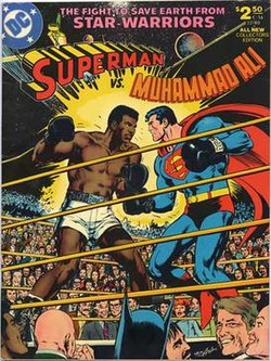
The image below to the left is from the 1990s, but is an example of a character design change that constitutes a narrative point rather than a shift in style. Note, however, the change in style of Superman's "s" shield, which corresponded also to a change in the design of the title of the comic.

No comments:
Post a Comment